

March 21, 2020, I began tracking COVID – specifically the daily numbers. I undertook this task for several reasons: I enjoy data, I wasn’t going anywhere for a while, but more specifically so that I could discuss it intelligently.
Clearly discernable trends have emerged over the last seven months. “Waves,” as some call them are clearly visible in the charts.
In this white paper I would like to provide the charts that have developed from my nightly tracking. No conclusions are drawn, no commentary is given, and no opinion is provided. This is purely data for data sake. You must draw your own conclusions, provide your own commentary and develop your own opinion.
Methodology
As stated, the information used to develop these charts have been tracked and recorded NIGHTLY since March 21. All information used as part of this tracking program is taken from WorldOMeter.com, Johns Hopkins and several state websites. Although each of these information sources undertake to provide correct data, neither they nor I can guarantee the information.
Because one day does not constitute a trend, these charts apply the 14-day rolling averages. Using a 14-day average removes the extreme spikes and valleys that are present in daily counts and even the spikes found in a 7-day rolling average. When this 14-day rolling average is NOT used, the description of the chart specifies that a different method is applied.
The time period tracked in these charts is the slightly more seven-month period between March 21 and October 31.
The only commentary I provide is a description of what information is graphed by the chart.
Shall we begin? I hope you find this information interesting if not valuable.
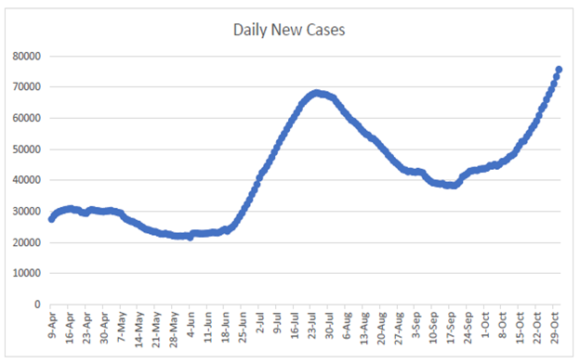
Daily New Cases
This charts the daily case count, again based on a 14-day rolling average.
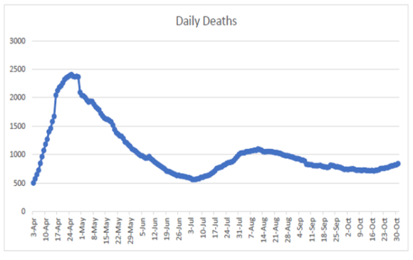
Daily Deaths
The following charts daily deaths applying the 14-day rolling average.
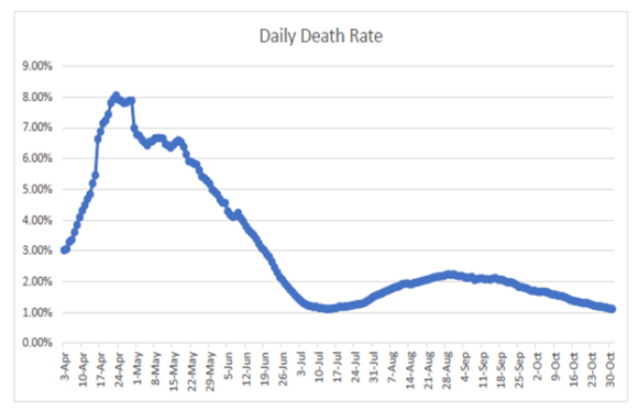
Daily Death Rate
This charts the daily death rate. The death rate presented in this chart is calculated by dividing the number of deaths on a given day by the number of new cases for that day. Although not an exact indication of the rolling death rate, because this chart uses the 14-day rolling average of cases and deaths, it is somewhat representative of the actual death rate.
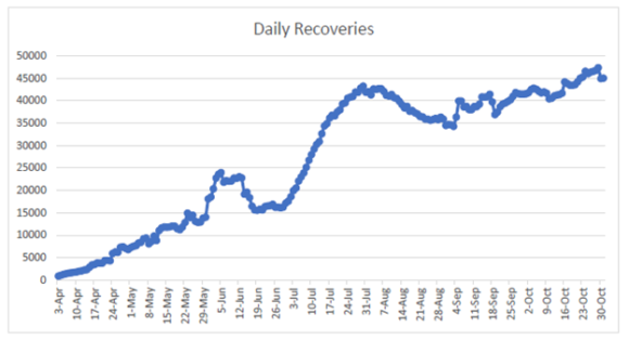
Recoveries
Following is the 14-day rolling recovery average.
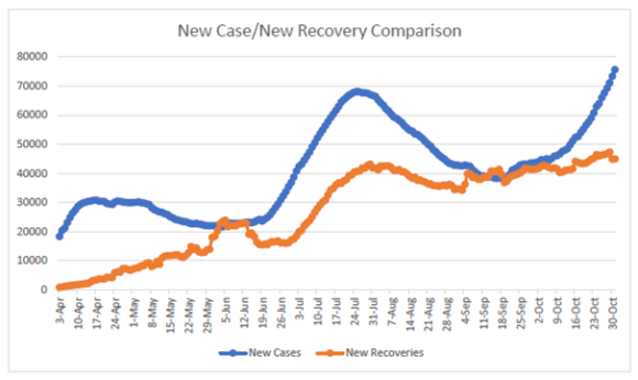
New Cases Compared to Recoveries
Two data points are compared in the following chart: 1) the daily new cases; and 2) the daily recoveries. The daily new cases are represented by the blue line and the orange line tracks recoveries. Again, these are using the 14-day rolling averages.
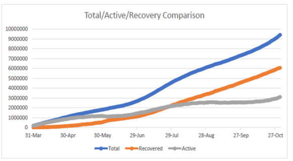
Combined Comparison
Three key data points are compared in the following chart: 1) Total reported cases; 2) Total recoveries; and 3) Total active. UNLIKE prior charts, this chart does NOT use a 14-day rolling average – this charts actual daily numbers.
The blue line is total reported cases; the gray tracks active cases; and the orange indicates recoveries.
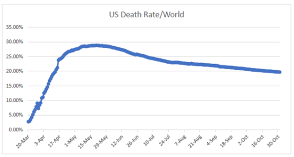
US Percentage of Total Deaths
According to WorldOMeter, COVID has affected 216 countries and territories – truly worldwide. The US accounts for approximately 4.29% of the world’s population. This chart tracks the what percentage of worldwide COVID deaths occurred in the US.
Like the previous comparison chart, this chart is NOT on a 14-day rolling, this tracks the daily percentage from March 20 to October 31.
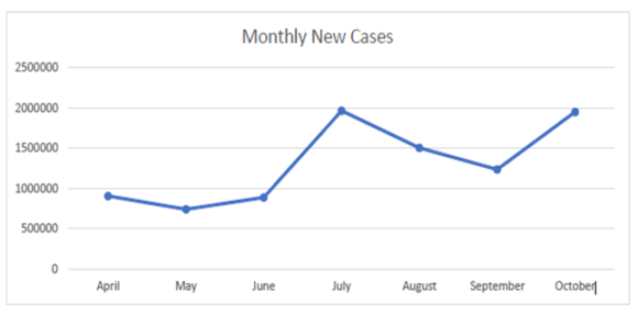
MONTHLY CHARTS
Following are three charts providing monthly information rather than a 14-day rolling average or even a daily charting of numbers. The following charts compare new cases, new deaths, and new recoveries for the months April through October.
Monthly New Cases
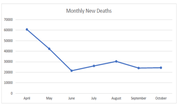
Monthly New Deaths
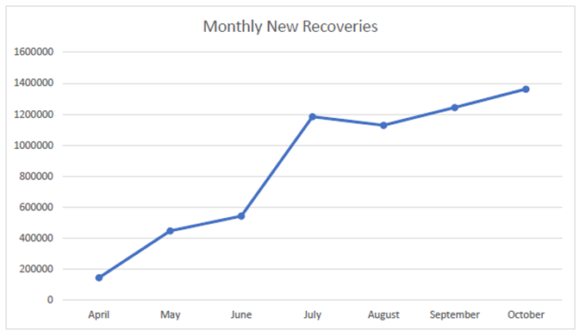
Monthly New Recoveries
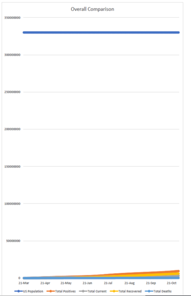
Overall Comparison
This last chart is essentially a tracking of the overall COVID numbers from March 21 through October 31. This chart compares all numbers to the US population. The color applicable codes are:
- Dark Blue: US Population
- Red/Orange: Total Number of Reported Cases
- Yellow: Total Recoveries
- Gray: Active Cases
- Light Blue: Total Deaths
Topics USA
Was this article valuable?
Here are more articles you may enjoy.
 Florida Engineers: Winds Under 110 mph Simply Do Not Damage Concrete Tiles
  Nine-Month 2025 Results Show P/C Underwriting Gain Skyrocketed
  What Analysts Are Saying About the 2026 P/C Insurance Market
  Trump’s Repeal of Climate Rule Opens a ‘New Front’ for Litigation